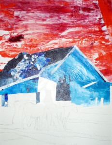
Red Hot Sky, Cool Blue Barn
The idea for a hot red sky occurred to me a week ago. I began cutting the sky-shape on the pinkish-cerise pre-painted papers. Because it is very textured with swirling paint patterns, I’m careful to choose a spot on the paper that is pleasing texturally. Some areas are lighter or too dark. I’m also using a clayboard surface as opposed to the usual 300# paper. This won’t warp or bend.
My main goal is good design, concentrating on a few simple shapes so the values “read” well from a distance — at least six feet away. I had thought about a gray barn roof, but decided it was too bland and neutral. My work is about color, so I choose a medium toned blue-black. The cool blue tones work well against the hot red sky. I cut some narrow strips for the eaves and decided to take a break for lunch. I laid white mat strips along the edge of the collage to view it critically and check if the design is working . So far, so good.